


Colour is more than decoration. It’s an emotional language that goes straight to the subconscious. In digital advertising, where everything starts with attention, colour psychology is a powerful way to influence what people decide.
We wrote this article in 2024 and updated it in October 2026. Below you’ll find what each colour says, examples of brands that use it well and a few rules for choosing.
01How colours affect decisions
Colour can change our mood and the way we buy. Red can encourage impulse buys, while blue can inspire trust. Once you understand how each colour works on emotions, you can make digital content that persuades.
On social media, where things move fast, colour can decide whether people stop at a post or scroll straight past. Used deliberately, it helps a brand get its message across and can lift engagement and conversions.
02What each colour says
Red: energy and urgency
Red grabs attention like no other colour. Linked with passion, energy and urgency, it suits calls to action (CTAs), promotions and sale announcements. A red “Buy now” button on an Instagram ad can draw more clicks, especially when it contrasts with the rest of the image.
You may remember the ads in the right-hand column of Facebook’s homepage, back when there was no dark mode: many used a white image with a red border, precisely to stand out.

Examples: the “Happy Can” McCann Milan created for Coca-Cola and Domino’s email with its “Order now” button.
Blue: trust and calm
Blue is the colour of trust and calm. Banks and tech companies favour it because it signals stability. On social media, posts in shades of blue create a sense of trust and professionalism.
Relaxation and meditation brands use it for a feeling of calm, as the app called, fittingly, Calm does.

Examples: Beneficial Bank ads in Creatopy’s selection and the Mercury campaign by AKG Creative.
Green: health and prosperity
Green suggests health, nature and prosperity. It suits brands selling natural products, those talking about sustainability and financial services. A campaign for an eco-friendly product can lean on green to underline its care for the environment.


Examples: the Everlane ad with the plastic bottle and the jacket, and True Botanicals products.
Yellow: optimism and caution
Yellow is the colour of optimism and happiness, but also of caution, just like on a traffic light. It stands out easily in a crowded feed and works well for posts meant to lift the mood, or for warnings.

Examples: a Coach post and a Disney anniversary post.
Orange: energy and action
Orange mixes the energy of red with the cheerfulness of yellow, suggesting action and enthusiasm. It’s a popular choice for CTAs because it nudges people to act without seeming as aggressive as red.


Examples: the Just Juice ad with the masked orange and the Metro and Uber doughnut ad.
Purple: luxury and mystery
Purple is associated with luxury, wisdom and spirituality. Brands with premium products or services use it to underline the quality and exclusivity of what they offer. It also turns up often in campaigns aimed at women.
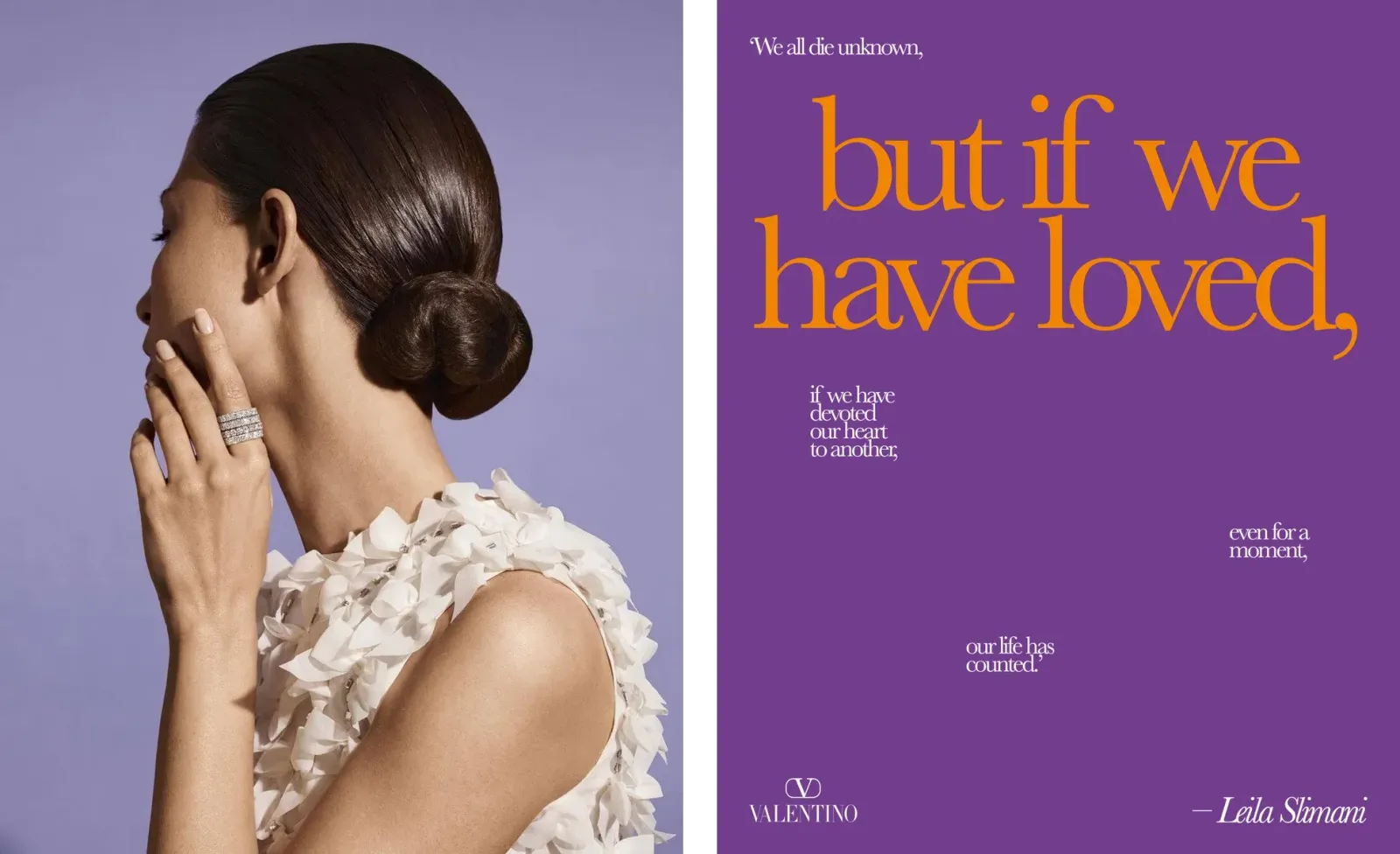
Examples: Asprey London jewellery and a Valentino poster.
Black: power and elegance
Black stands for power, elegance and mystery. In digital marketing it brings a sense of sophistication and exclusivity, a natural fit for luxury fashion or high-tech products. Pair it with white or gold and you’re in luxury territory.


Examples: the Tesla Model S wind tunnel ad and a Saint Laurent campaign.
White: simplicity and purity
White stands for purity, minimalism and peace. In social media design it gives a layout room to breathe and brings clarity. Brands that want to come across as simple and efficient use it to clear the clutter from their visual communication.

Examples: Chanel hand creams and a The Ordinary serum.
Subscribe to the newsletter.
Like how we think? Get an article like this one twice a month.
03How to choose colours for your audience
To get the most from colour, start from the people you’re talking to, not only from the brand palette. A few useful rules:
- Cultural context. The same colour can mean different things from one culture or audience to another, so check what it means to yours.
- Brand identity. Choose colours that fit the brand and, at the same time, speak to the emotions and values of your audience.
- Contrast. Text has to be easy to read. The WCAG standard asks for a contrast ratio of at least 4.5:1 for normal text and 3:1 for large text, and the European Accessibility Act also covers e-commerce.
- Testing. A red button doesn’t win by default. Compare the options in an A/B test before you change all your communication.
04In short
Colour psychology gives brands a strong way to connect with people on an emotional level. When attention is scarce, a colour chosen deliberately can decide whether your content gets noticed or overlooked.
If you found this useful and want to hear what else is new, subscribe to the Digital Star newsletter.